Boutique music agency built on rhythm and precision

A visual language rooted in sound
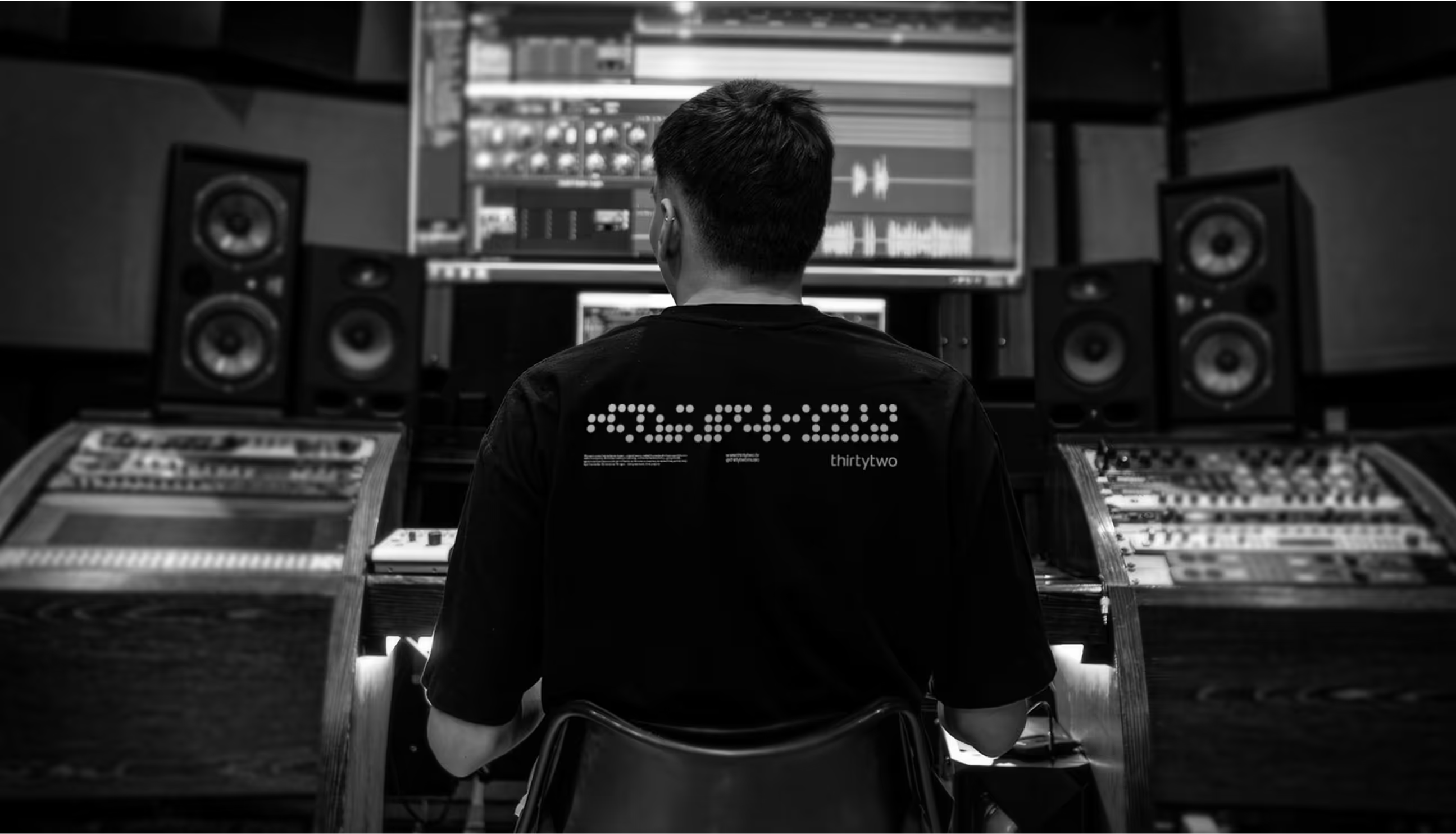
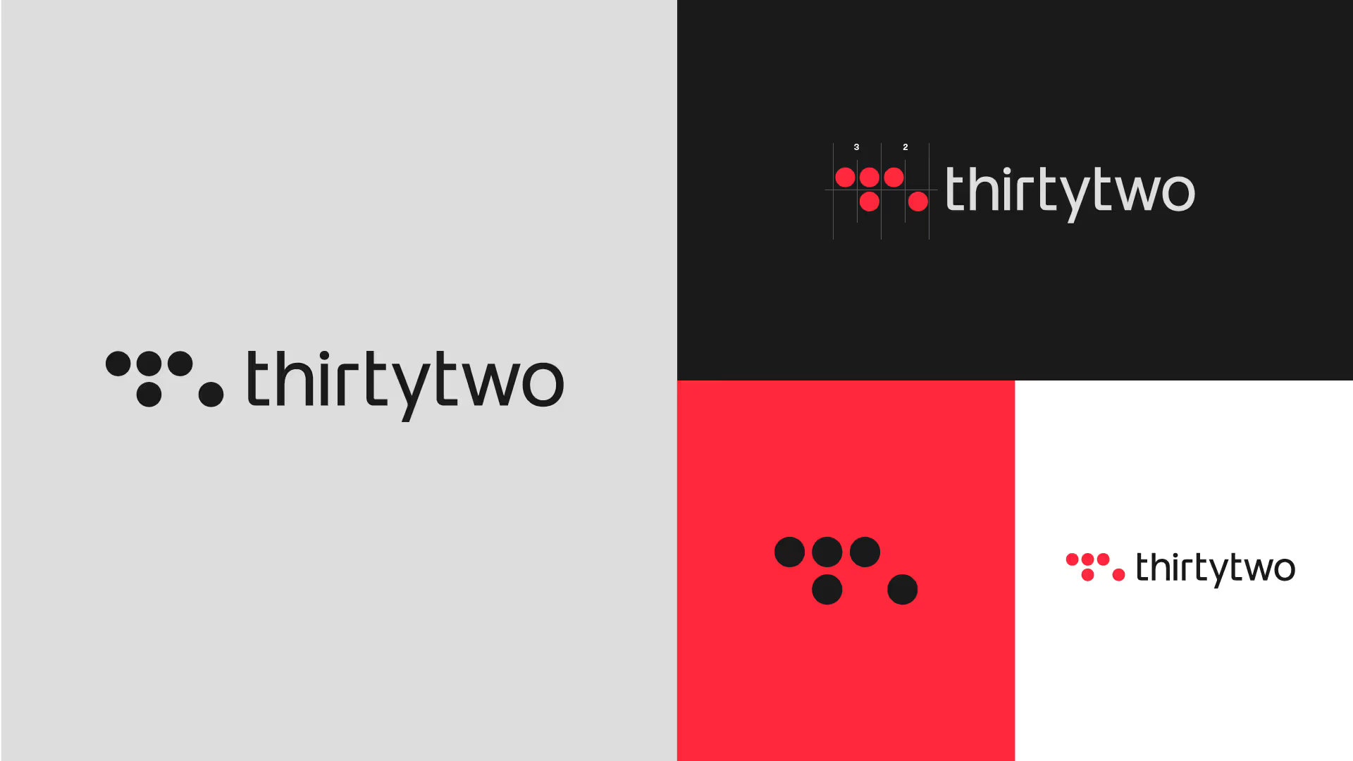
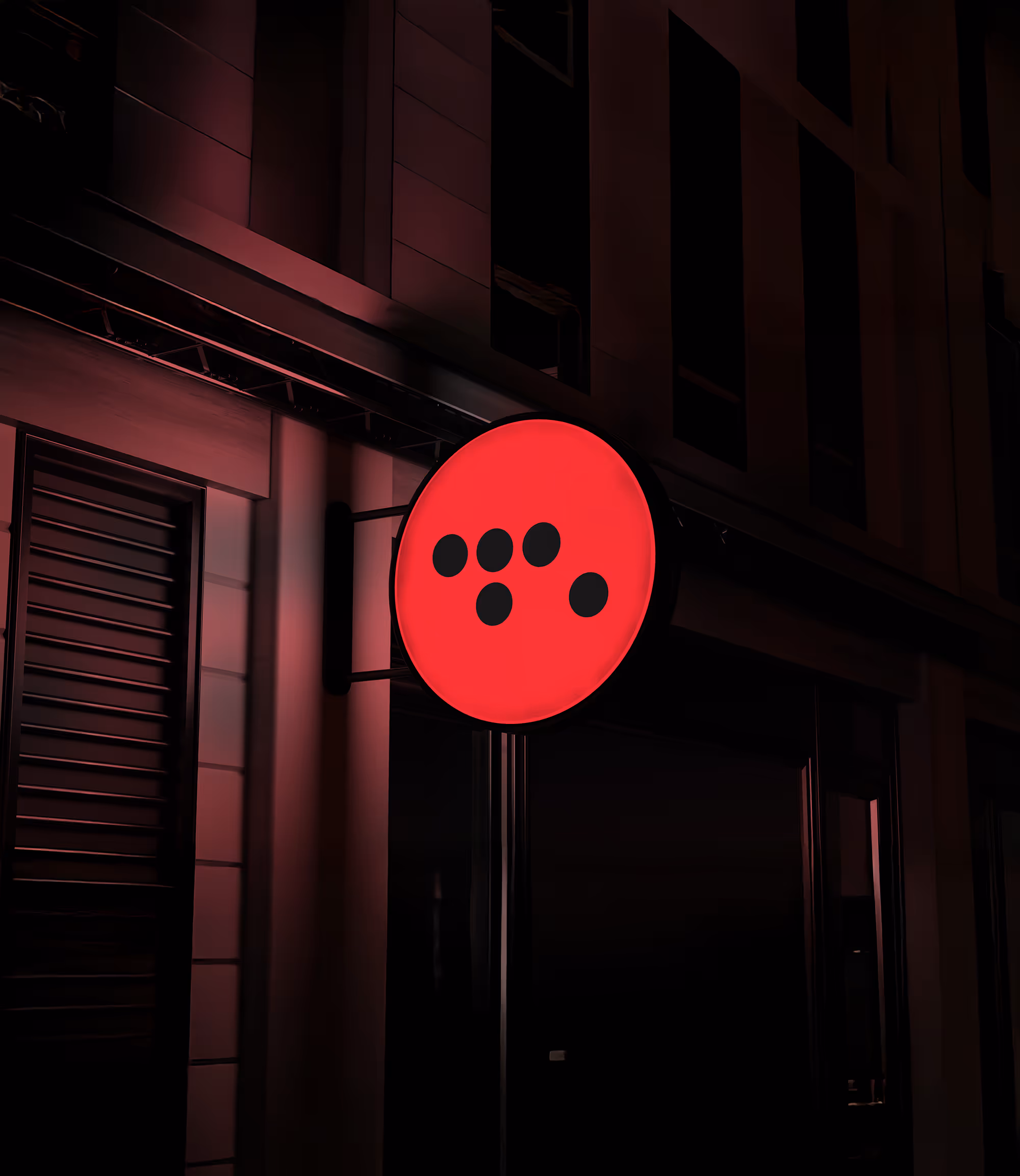
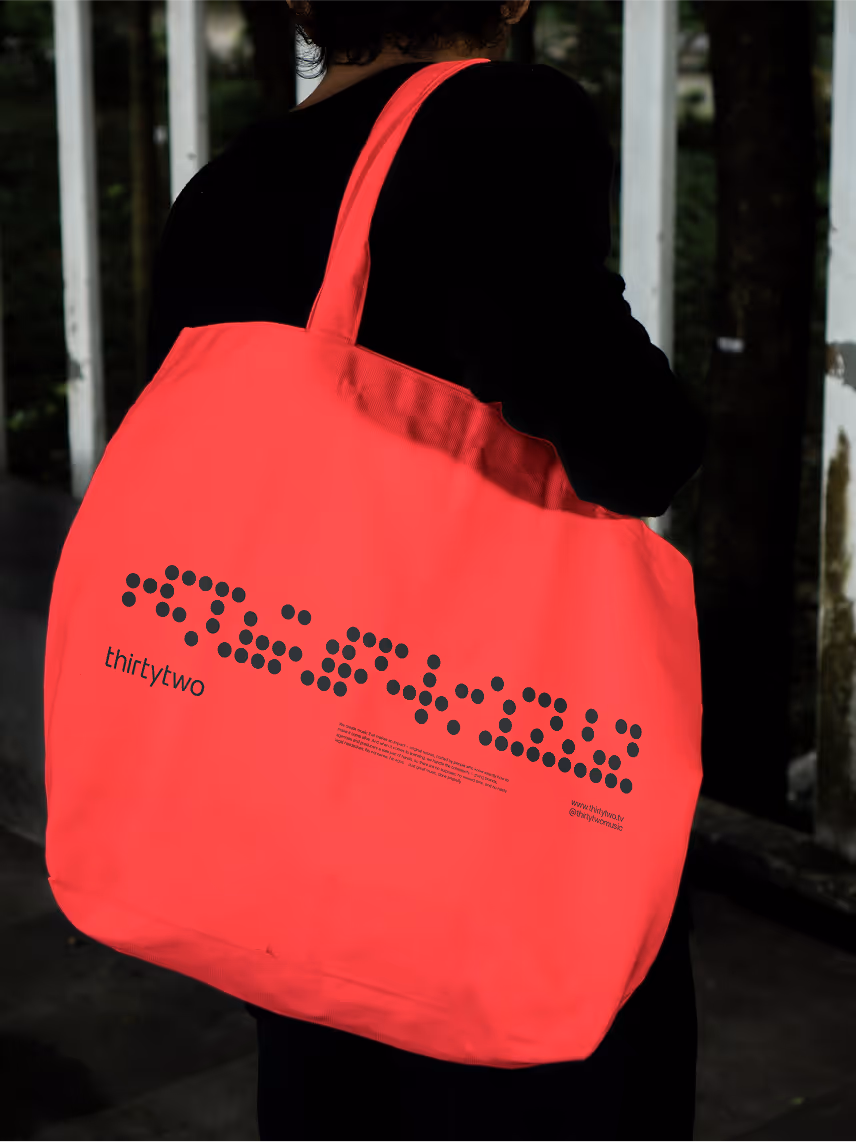
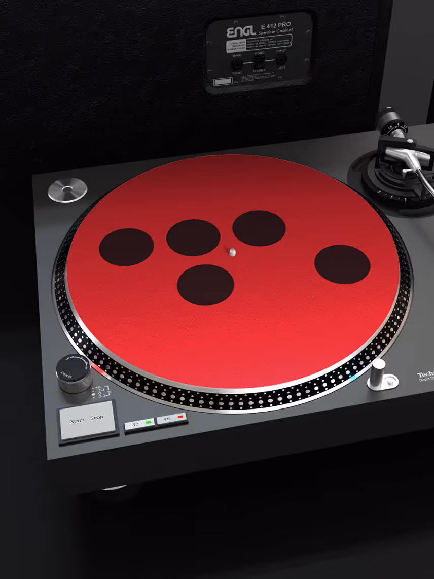
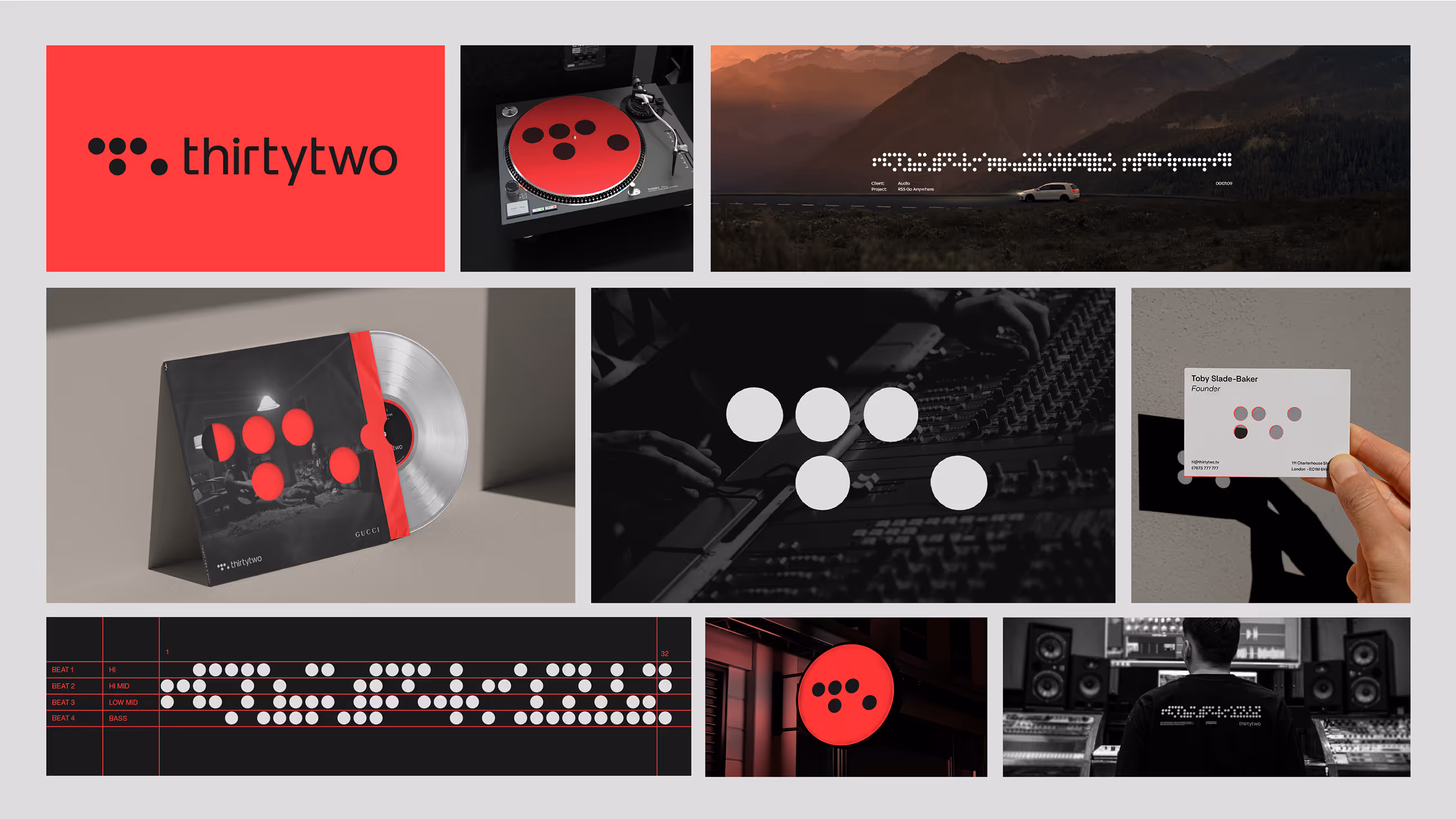
Thirty Two Music is a boutique music agency built on rhythm and precision. The business is extremely well respected in its space and has a long history of delivering music that makes an impact and brings client projects to life. However, Thirty Two had never really focused on its brand and wanted to create something that matched its position in the industry. Drawing inspiration from ‘player piano’ book music punch cards and step sequencers, we developed a visual language based on dot matrices, capturing the harmony of rhythm, accuracy and structured creativity. It creates a visual reference that instantly shows what Thirty Two brings to a project and shines a light on the impact the right music can have on a production.


Developing the audio array tool
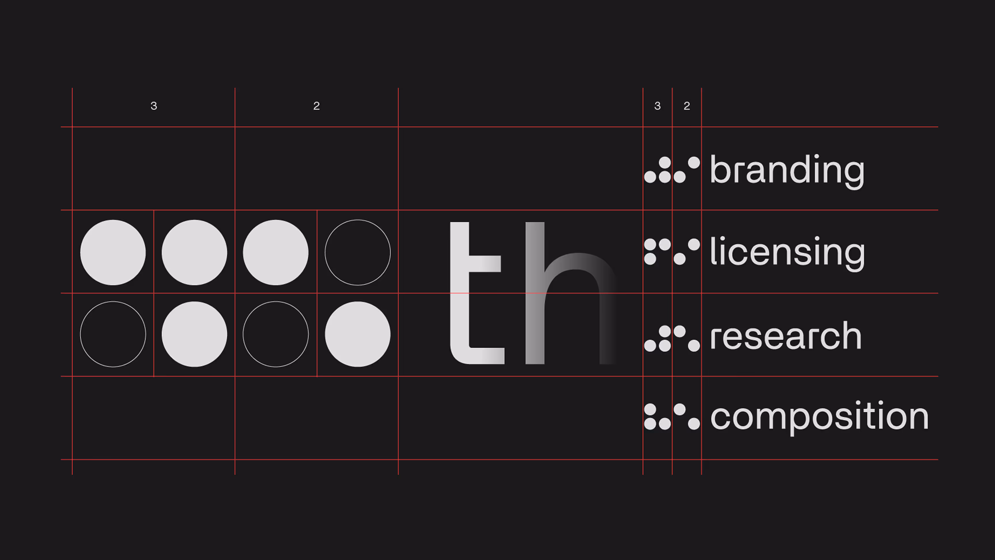
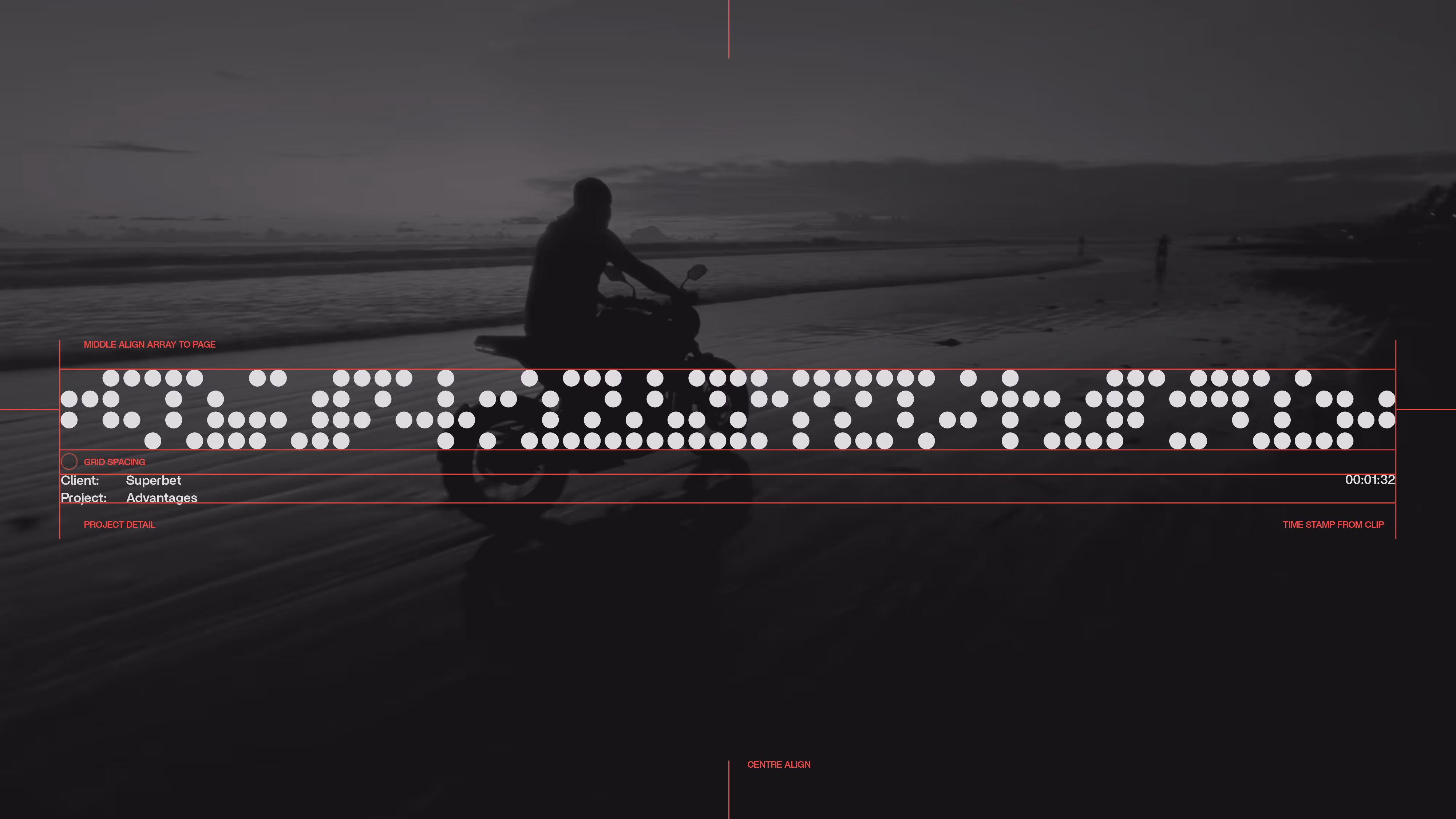
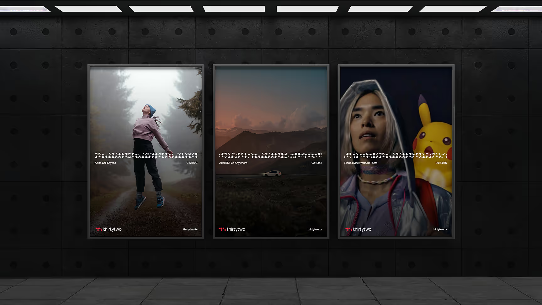
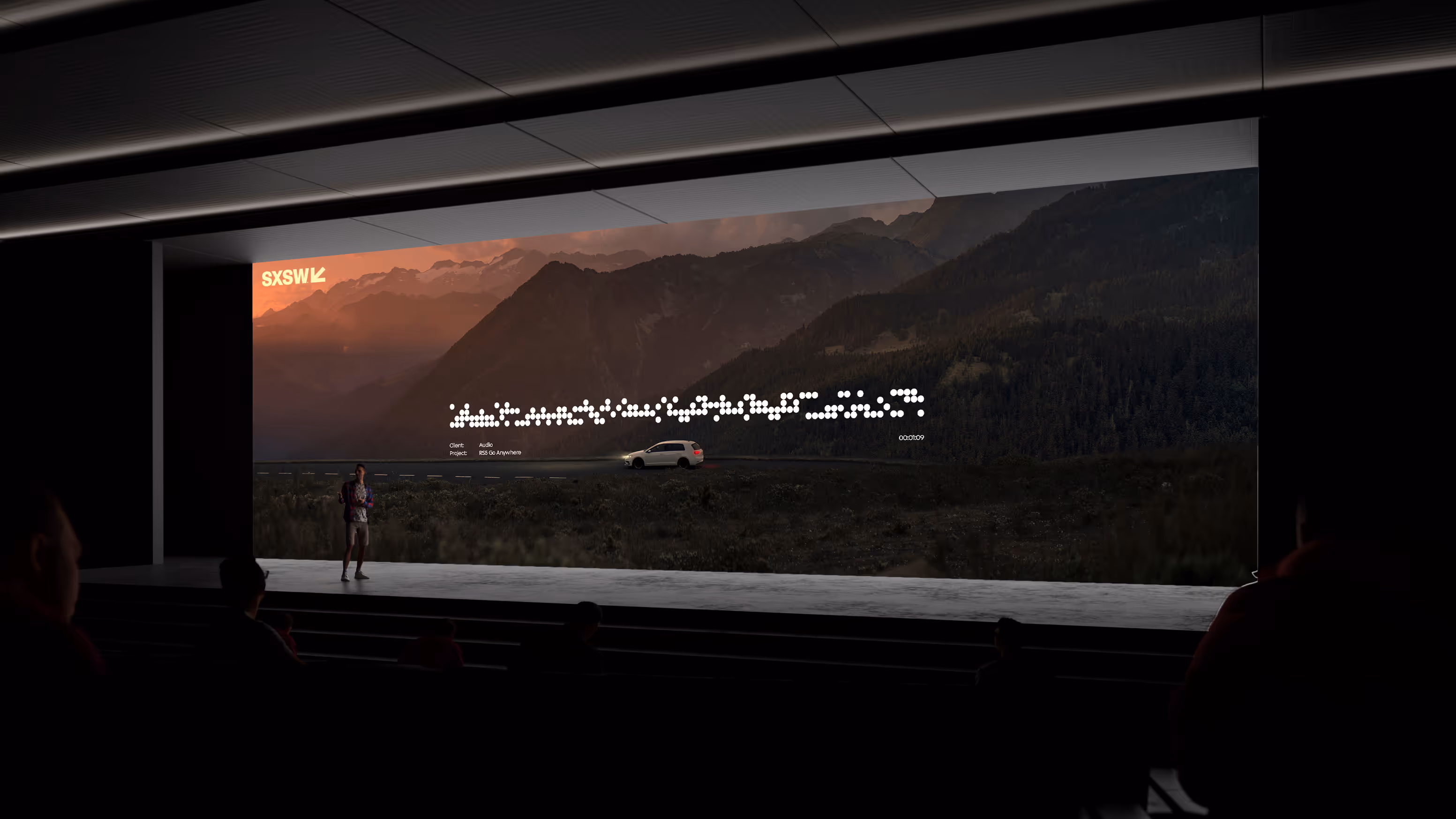
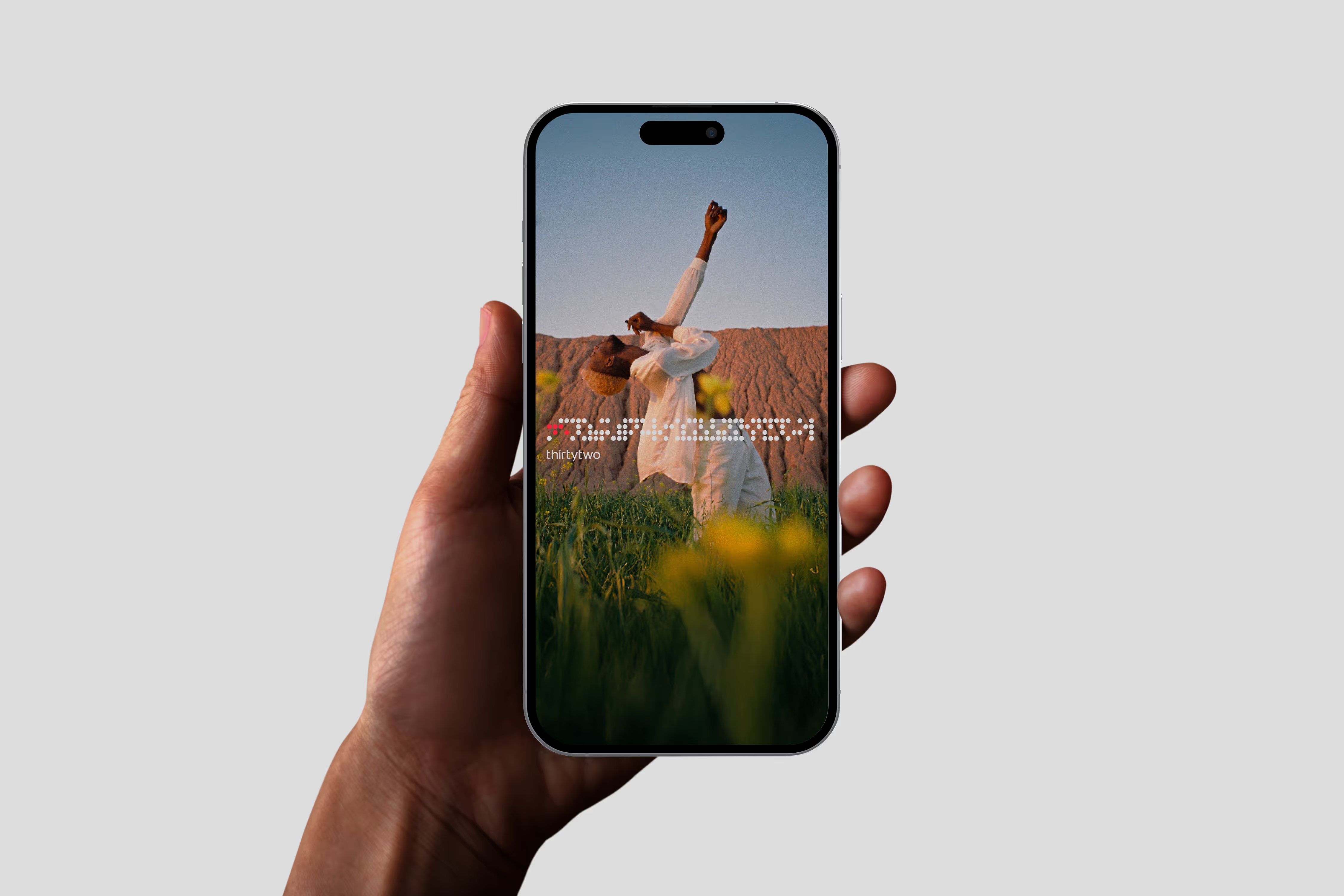
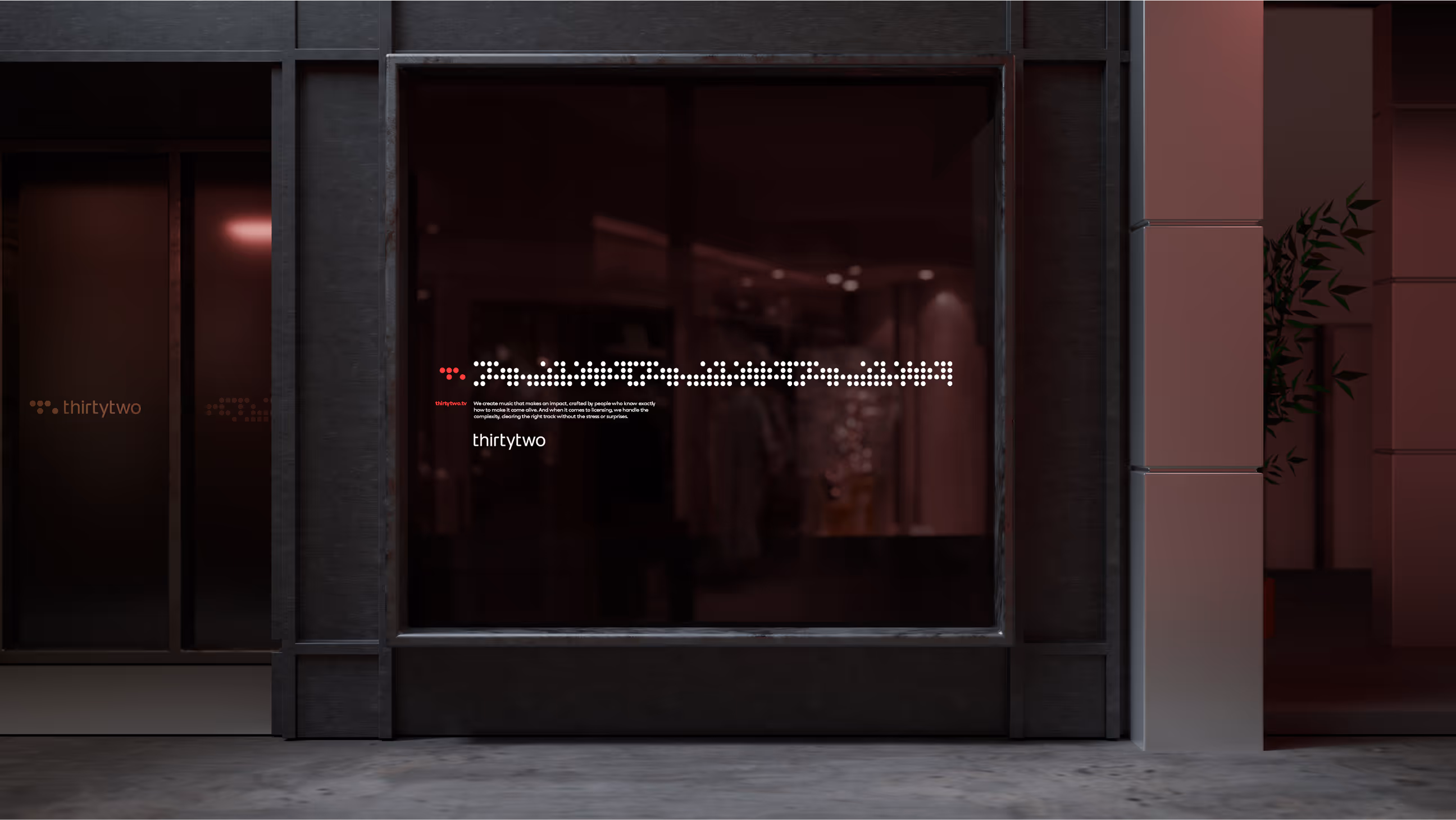
Thirty Two has the ability to see music where others do not, bringing life and energy to things that might otherwise seem ordinary. We sought to make their practice visible. To achieve this, we built a tool in processing that uses audio inputs to generatively build a dot matrix on a structured 32x4 grid. By running the studio’s sonic identity, brand film or other audio through this tool, we can produce a variety of 'audio array' patterns used across the visual identity. These patterns are divided into a grid four rows, each representing musical beats and parts of the audio spectrum: high, high mids, low mids and bass. Each of the thirty two columns corresponds to a bar of music.
A design system where every beat matters
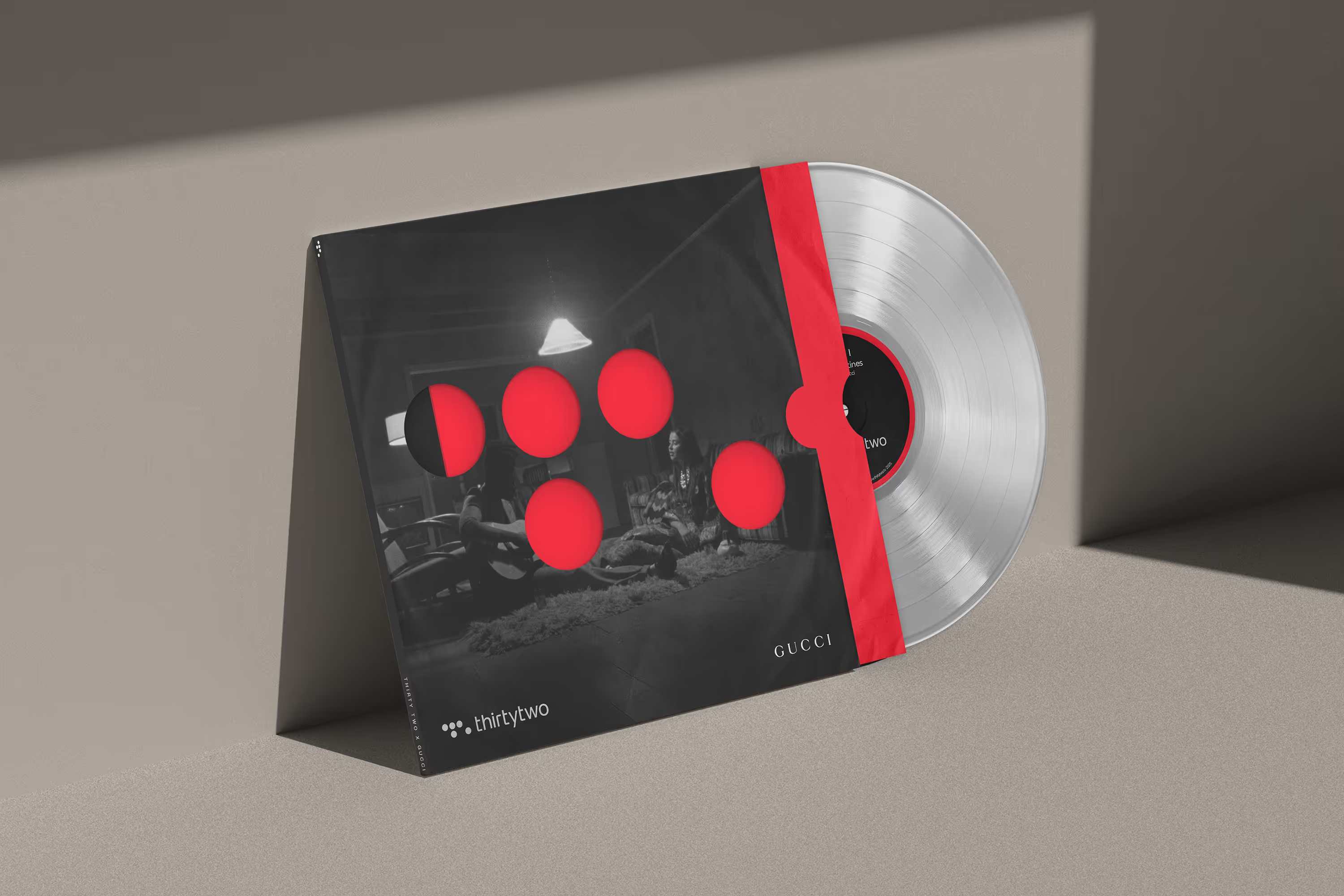
Stationery is die cut with our mark, reinforcing the creative direction of 'player piano' music punch cards. In static promotional materials, the audio array is shaped by the specific film the still originates from, creating a unique yet instantly recognisable visual device. For high-profile projects, special acetates are created as client gifts, featuring a still from the work on the cover, die-cut with the logomark to reveal the brand’s signature 'Redline Red' on the inner sleeve.